Jetpack Compose Accessibility : Reading out the position of items in custom list and grids
With just additional two lines of code, you just made an accessible list or grid implementation that respect the user's preference. Since it allows configuring how many rows and columns there are...

Recently I had to implement a custom list implementation in Jetpack Compose, without using out of the box lazy collection implementations. The code itself was a straight forward one and we thought we did a good job until testing uncovered that we're missing some important accessibility features that the existing implementation already have which is the ability to inform the users that they are currently traversing through a list alongside which position of the list they are currently at. I'll break down the steps we took until we got our final solution but if you want a TLDR working code to copy, feel free to scroll to the end.
For the sake of simplifying our custom implementation, I'll use Row as example here but do note that it's applicable to similar implementations too.
@Composable
fun CustomList() {
  val items = (0..10).map { it.toString() }

  Column {
    items.forEach {
      Card {
        Text("Row $it", modifier = Modifier.padding(8.dp))
      }
      Spacer(modifier = Modifier.height(8.dp))
    }
  }
}Of course, the simplest solution is just overriding the accessibility label and adding the position of the item.
@Composable
fun CustomList() {
  val items = (0..10).map { it.toString() }

  Column {
    items.forEachIndexed { index, item ->
      Card(modifier = Modifier.semantics(
        mergeDescendants = true
      ) {
        // Modify accessibility label
        contentDescription = "Row $item ${index + 1} out of ${items.size}"
      }) {
        Text("Row $item", modifier = Modifier.padding(8.dp))
      }
      Spacer(modifier = Modifier.height(8.dp))
    }
  }
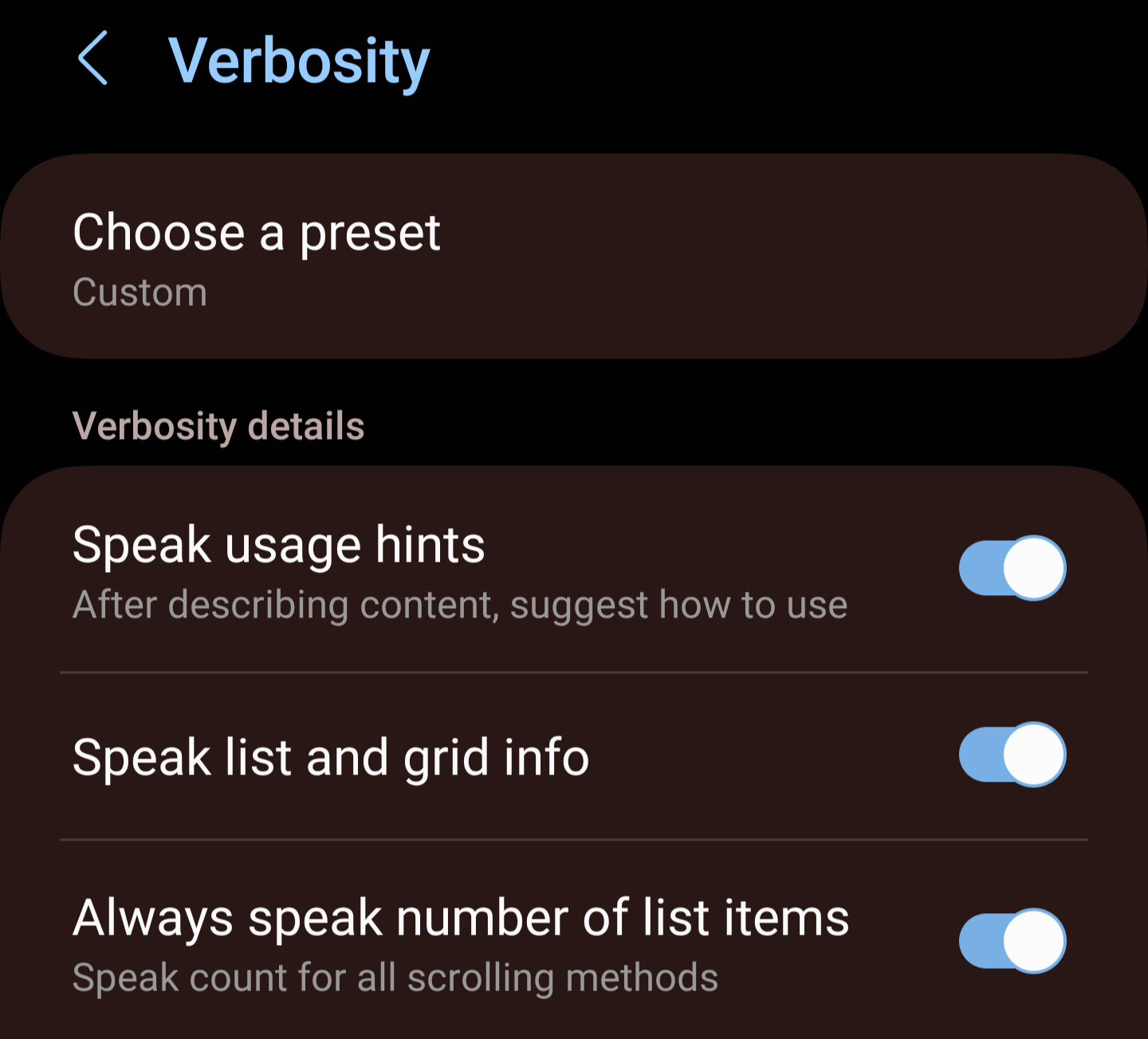
}However, this is not a complete working solution. Although it now has the position as part of the accessibility label, it doesn't tell the Android operating system that these items are part of a list, meaning it is not compliant to work with special accessibility controls for list traversal. Moreover, Some accessibility services, for example Talkback, allow user to configure the verbosity, one of which is the preference to read the information of list and grid. The solution above does not take these settings into consideration, and thus would read it out even if the user prefer not to do so.

So what's next? Luckily, Jetpack Compose has an API for that called CollectionInfo. By using this API, you can not only tell the Android operation system that your custom composable is a list but also add position information. The way to use it also very straight forward.
- First, on your parent composable, specify the CollectionInfo in semantics.
- Secondly, on each child item (preferably on a root composable of child items), add CollectionItemInfo semantic property.
An example complete code looks something like this
@Composable
fun CustomList() {
  val items = (0..10).map { it.toString() }

  Column(
    modifier = Modifier.semantics {
      // Specify how many row and column you have
      collectionInfo = CollectionInfo(rowCount = items.size, columnCount =  1)
    }
  ) {
    items.forEachIndexed { index, item ->
      Card(modifier = Modifier.semantics(
        mergeDescendants = true
      ) {
        // Specify which index this item sits in and how many span it takes
        collectionItemInfo = CollectionItemInfo(
          rowIndex = index,
          rowSpan = 1,
          columnIndex =  0,
          columnSpan = 1
        )
      }) {
        Text("Row $item", modifier = Modifier.padding(8.dp))
      }
      Spacer(modifier = Modifier.height(8.dp))
    }
  }
}Voila! That's it, with just additional two lines of code, you just made an accessible list or grid implementation that respect the user's preference. Since it allows configuring how many rows and columns there are as well as how many spans each item takes, this can be used for grids, tables and any collection representation you can think of. One call out I want to do here is that always use out of box implementation whenever possible and only code custom implemenation as last resort. Out of the box implemenations take various accessibiltiy into consideration which your custom code might not have, leading to an awful user experience.
Anyhow, It took me a while to figure it out but hopefully with this blog post, I saved a ton of head scratching time for you 😉 If you're a Burmese reader, then do check out my talk on Accessibility for Android apps as well!