Android Iconography: Notification
In Android, notification icon is hugely different from other icons used by the app. Most noticeably, The icon asset cannot have any color


Icons are a crucial part of every app and software. They are more than just a visual component; they are the identity of your app. It's important to represent what your app is in the icon. However, this is far from easy, especially when you have to support multiple platforms where each has its own specifications and limitations on what your icon can or cannot have. Since each OS has their own specification for icons, sometimes it's best to have an specification document you can reference to. And for Android, there used to be a long spec documentation by Google that is now long lost to the depth of the Internet history. Hence, I took the liberty to scribe these lost knowledge with a blog post. (tldr below for those lazy folks)
What is Notification Icon?
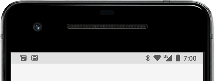
When a notification has been issued to a user, it first appears under the status bar.
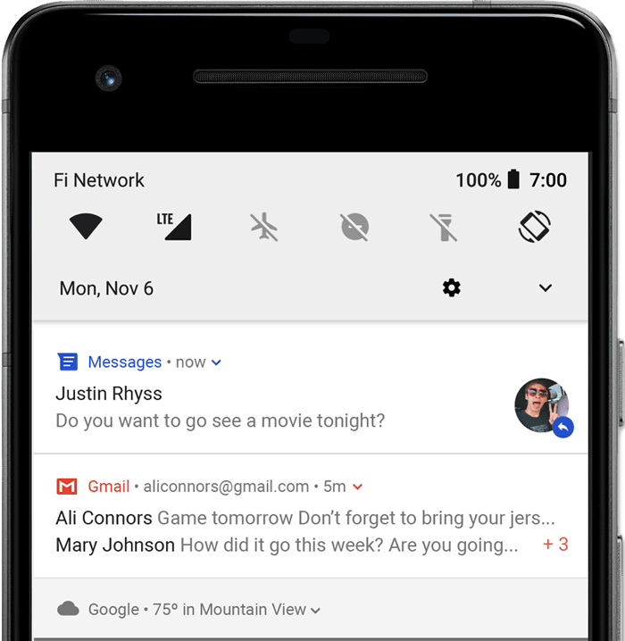
When the user swipes down the status bar, the notification drawer will expand and you can see your notification in this notification drawer.
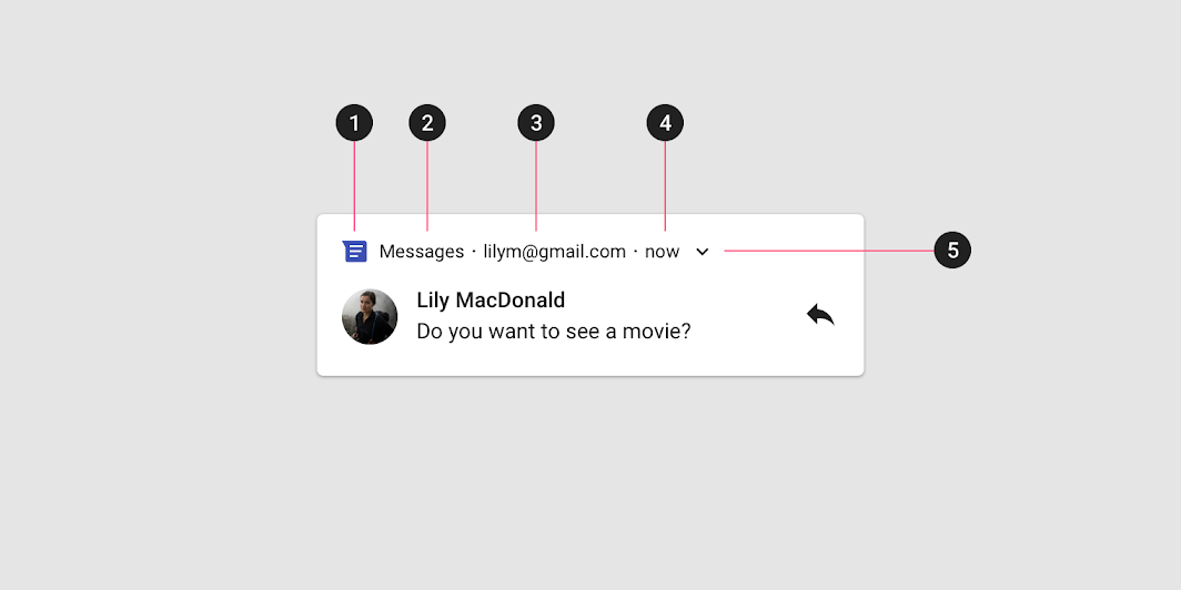
The anatomy of notification composes of multiple elements. One of them is the icon on the header area. No.1 in the picture below is the notification icon that will be referred to throughout the blog post.
With that being said, let's break down how the notification icon is rendered by the Android OS.
Rendering Android notification icon
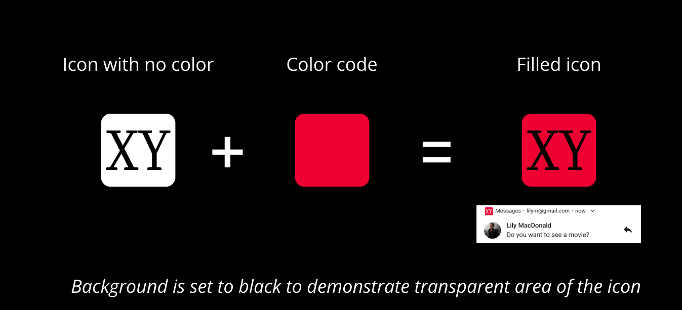
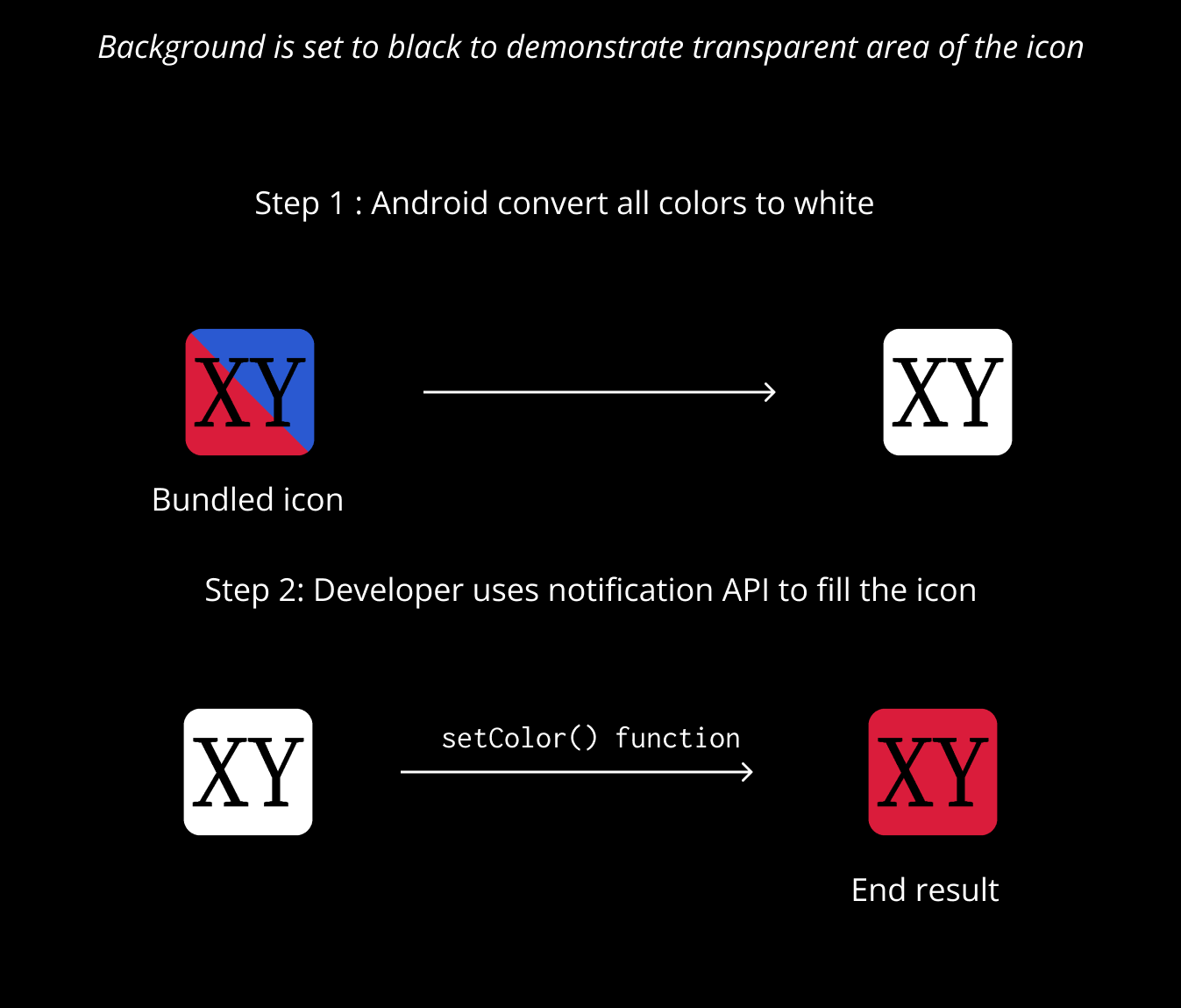
In Android, notification icon is hugely different from other icons that you have in your app. Most notably, The icon asset cannot have any color. Android makes a huge change to notification back in Android 5.0 and since then, the Android OS ignores all color channels in your notification icon. Let's take a look into the following icon:

What you saw above can be broken down into a combination of two components; an icon with no color and the color. The icon is a colorless static component that is bundled into the app, and the color is a dynamic component which can be changed while the app is running.
How does Android combine these two?
Firstly, System ignores color channels, for example in ARGB, it ignores RGB channels. Thus the system sees only white color. What it means is that any shapes you want to stand out (such as XY in the above example and the letter f in the Facebook logo) should be transparent so that when the color is added, that distinct shape will be left out.
The color is then filled into the icon by calling the setColor function from the code when we're creating notification. The function tells the Android OS to populate color channel (e.g RGB in ARGB) in your icon with the color you specified. As an end result, the users see the colored icon on their notification drawer.
To burst the bubble, there's no workaround to render multiple colors at the same time, make sure your team understands this beforehand. You don't want to go back to drawing board after spending so much time just to realize it's not supported down the line. With that being said, do note that you can have different degrees of alpha channel i.e, different tints of the color.
Rendering on Status Bar
As for the color on the status bar, it's rendered by the OS depending on the color of the status bar. Once again, you have no control over this and there is no workaround for it.

TL DR
If you're a developer, ask your designer
- A icon with no color, preferably a SVG.
- The color to be used in hex code
- Use
setColorin theNotification.Builder
And as a designer
- You cannot use multiple colors
- You can however use different color on different notification, it might be useful in case ; like for example, red for error notification, green for success notification.
Resources
- Android Asset Studio - useful to generate a copy-pasteable Android-specific structured resource folder from the icon the designer give you. Designer can also use this tool to test how the icon will be rendered by the OS.
- Android Studio Image Asset Studio - Similar to Android Asset Studio but bundled inside Android Studio.
Hope it was a good read for you and if you enjoyed the content, feel free to share with your cycle. See you on the next post.